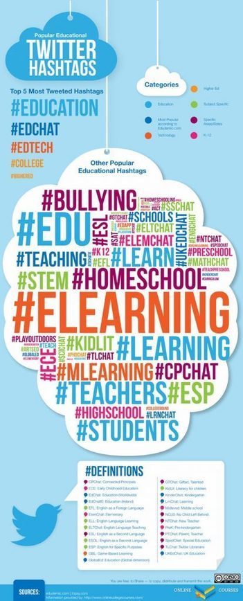
"As an education blogger, its hard to keep up with the latest social media trends, especially when it comes to hashtags. I am sure that all educators who use social media can relate to this. I found this great infographic that contains the hashtags that all educators should be using in 2018."
HTML5 has been a buzzword in the eLearning industry for a long time now. Many are aware that courses published to HTML5 output work on multiple devices, but very few people know what it actually means and how it’s really connected to eLearning.
Compatibility with various platforms and multiple devices, augmenting mobile learning, have made it the hot favorite in the Learning and Development circle. However, there are two sides to every coin, and HTML5 has its cons along with its much talked about pros. Here are the pros and cons of HTML5 in E-learning.
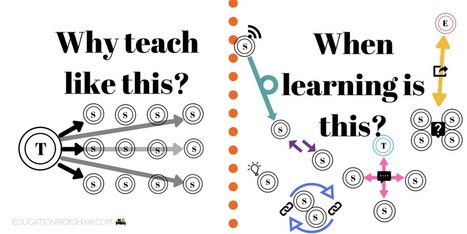
Time to Throw Out the Playbook In looking back at my parents’ education in the 1950s and 60s, and my own education in the 1990s and 2000s, I worry sometimes that despite the huge advances that we’ve seen in technology, not much has changed when it comes to how we view learning and how we design learning environments. The transmission model of education is still the name of the game, although in some circles there are signs of its erosion.
I would like to take you on a journey in this post, starting from the 1950s banking model (Freire, 1968) of instructional design, before comparing it to my own schooling experiences as a digital native at the turn of the century. Then, finally, I would like to share my vision for C21 learning, and propose some ways that we can move forward so that we are meeting the needs of today.
Los modelos educativos se han mantenido durante muchos años, pero ¿y si ya no son tan eficaces? ¿Y si es necesario una revisión para mejorar? Este artículo te hará reflexionar sobre estas y otras cuestiones.
No se ha visto un cambio mayor en la estructura de las clases Americanas. Este articulo compara la estructura de los años 1950s a el de los 1990 y a los actuales. El problema que identifican es la interacción linear entre profesor y estudiante. El blog tiene mas artículos que elabora las formas en que se pueden organizar las clases, y ayudar que la aula sea dirigida mas por los estudiantes y menos por los profesores. Este articulo elabora sobre la estructura ideal de las clases en el siglo 21: https://educationrickshaw.com/2017/08/02/what-does-a-21st-century-classroom-look-sound-and-feel-like/
Hello, World! Lots of my friends have been asking me how I make the infographics. I find it very simple. But, I admit that that simple mindset is after hundreds of hours playing with Piktochart. I ...
Hi Kimberly! Thanks for thumbs up!
Also we ask teachers to fill a survey that could help us to improve. Maybe you could find a few minutes to fill it yourself and pass to other teachers who use it? Thanks!
ow.ly/oJahy
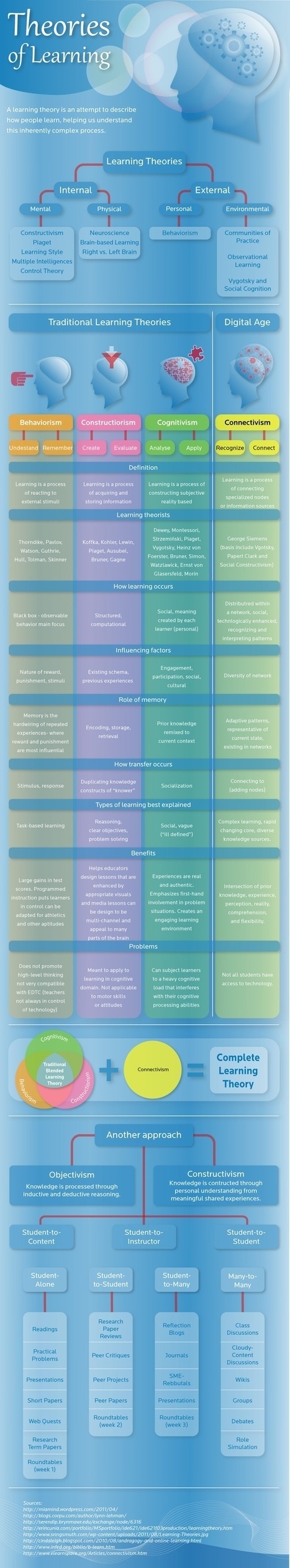
Connectivism is one of my favorite learning theory to use in the classroom. As a Career and Technology teacher we use technology and connectivity theory allows the students to discuss to various platforms to discuss and find answers on their own. With this infographic it explain the different learning theories and connectivism, a theory that at least you have to try to implement for student engagement.
In Professional Learning in the Digital Age: The Educator's Guide to User-Generated Learning, Kristen Swanson shows educators how to enhance their pro...
This is very insightful when creating an effective, authentic and reliable curation collection. It is resources like this one that I feel will benefit others in their teaching and learning journey.
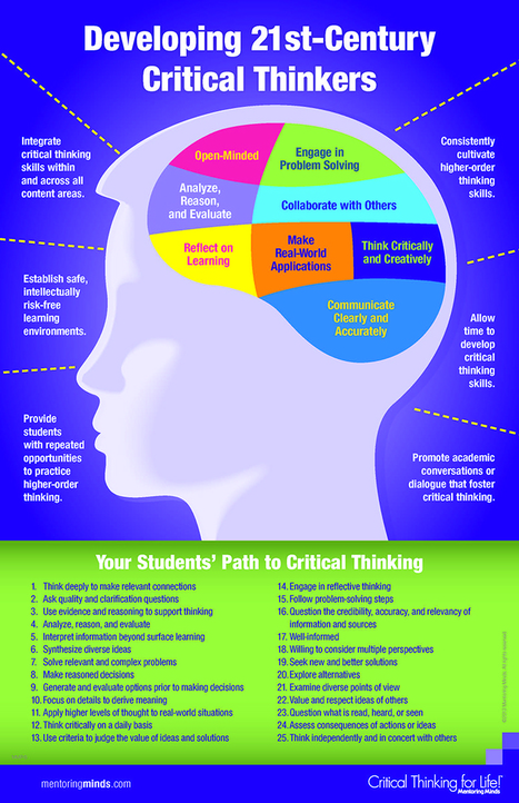
This infographic provides insight into showing how to enhance learning. Critical thinking is an important skill in today's world. Students need encouragement in taking ownership of their own learning. We can find ways to encourage students from this link.
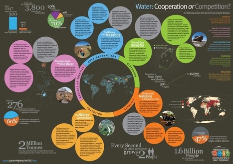
To help promote the International Year of Water Cooperation, which is launched this week, this diagram explores the main challenges faced by water cooperation today...
Will the steering wheel, brakes and gas pedal be replaced with sensors and software?
Cars that talk to each other are being tested in Ann Arbor, Mich., in the largest vehicle-to-vehicle pilot in the nation, and testing of self-driving cars has been approved in both California and Nevada. In fact, the Institute of Electrical and Electronics Engineers (IEEE) predicts that in 2040, 75 percent of cars on the road will be self-driving.
A recent press release on Top 10 Future Car Technologiesfrom Total Car Score mirrors much of the information from the following infographic from InsuranceQuotes.com, which shows what other features cars in the future might have. Think super fuel efficiency, media on demand, voice control and zero maintenance...
This infographic gives some great information about recycling. It includes facts about the different materials that can be recycled, what Americans throw away, as well as the top 10 greenest states in the US, of which Vermont tops the list...
In their feature essay, “China’s Green Rise: Growing Ambition, Growing Challenges,” Genia Kostka and Sarah Eaton detail the rise of China’s green energy sector.
Here, we consider the bigger picture. This infographic details global investment in utility-scale green energy companies and projects between 2004 and 2010...
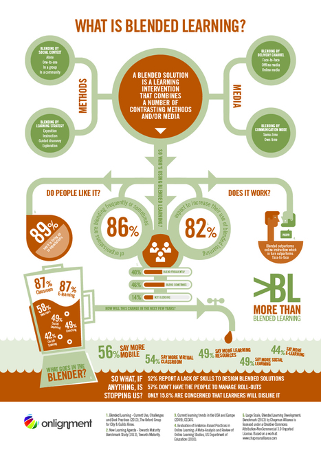
Blended learning is now the strategy of choice for most major employers across the world – but few are taking full advantage of the opportunities it presents. Blended solutions can be so much more powerful than just simple combinations of classroom and eLearning, instead assisting the employee on every step of their learning journey. The What is Blended Learning Infographic provides a broad-ranging, contemporary description of blended learning as defined in the book More Than Blended Learning (Clive Shepherd, 2015). More Than Blended Learning (>BL) is a refreshingly different but simple new approach to the design of learning solutions. Blended solutions combine contrasting learning methods and media in order to maximise effectiveness and efficiency. The More Than Blended Learning approach goes a step further to ensure the blend results in application to real-world tasks and the learner is supported along the whole length of their learning journey.
Have you ever wanted to sneak into your favorite blogger's computer and see what tools and programs he/she uses to make her website look so awesome? Well, I have. And I've stalked other bloggers tr...
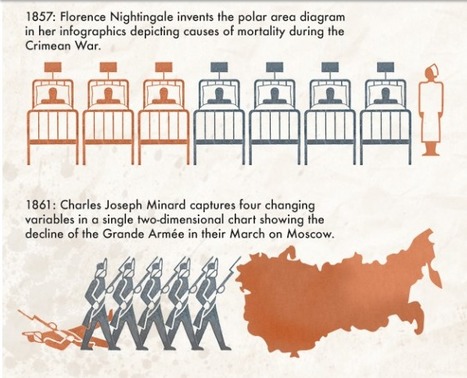
If you were to ask your students when infographics were first created what do you think their answer would be? What would your answer be? This infographic looks at "a timeline of timelines and infographics" and the result may surprise your students. It would be a good to use as an introduction to infographics along with the one that was put out using Legos to answer the question "What is an infographic?" located at
As the old saying goes: "A picture is worth a thousand words." This also reminds me of Malcomb Gladwell's book, "Blink." Amazon: http://amzn.to/13AalVQ
It's important to keep in mind your audience and how the ideal prospect likes to consume content. Scientists or engineers for example my consume or respect different media than consumers of clothing or electronics.
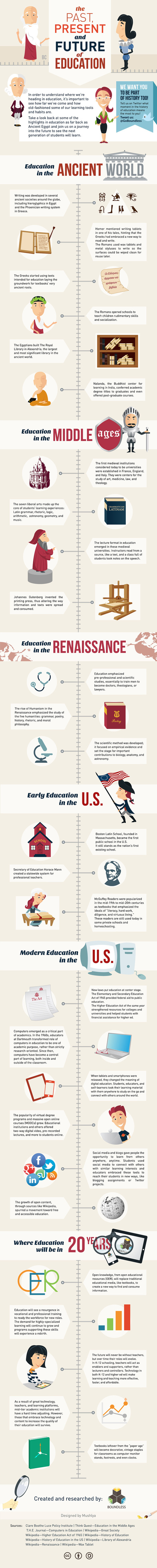
The folks at Boundless who last brought us the EdTech Buzzwords Infographic are back with The History of Education. The graphic takes a look at how formal education began, changes along the way, current day and predictions for the next twenty years.
The folks at Boundless who last brought us the EdTech Buzzwords Infographic are back with The History of Education. The graphic takes a look at how formal education began, changes along the way, current day and predictions for the next twenty years.
I think that this is such a great visual for my generation. It is so representative of how we rely, and use technology to demonstrate common core values in the classroom. This is great but it also could be our achilles heel, we need to apeal to all types of learners and visual is just one, there are so many more type that must be catered to so that we can be affective.
Politicians and oil companies might waste time debating whether or not we’ve reached peak oil. What they ignore is that we run out completely in under 40 years’ time, by which time a third of the planet’s biodiversity will be lost.
In the meantime, tantalum, that great mainstay of mobile telecoms, will last only a few years more and run out just in time to celebrate the planet breaking the 2oC barrier in 2060. There’s so much more words could say, but this, a very relevant and informative environmensl visualization, says is so much better...
Why should an everyday homeowner care that the smart grid can increase the U.S. electric grid's efficiency by 9 percent?
And what does that amount to in terms of energy and monetary savings? This infographic visually highlights those savings and what they actually mean to consumers.
The effort aims to connect the consumer with the smart grid, by explaining it simply and driving home the many benefits of smart grid technology, including: cost savings, energy efficiency, improved outage detection and resolution, as well as environmental benefits,.
“By highlighting the conveniences and benefits the smart grid can bring to consumers, the SGCC and its members can help consumers understand the smart grid just as they understand other, consumer-friendly, ‘smart’ technologies they wouldn’t consider living without – such as a smart phone, computer or television.”
To get content containing either thought or leadership enter:
To get content containing both thought and leadership enter:
To get content containing the expression thought leadership enter:
You can enter several keywords and you can refine them whenever you want. Our suggestion engine uses more signals but entering a few keywords here will rapidly give you great content to curate.


 Your new post is loading...


![Pros and Cons of HTML5 in E-learning [Infographic] | Help and Support everybody around the world | Scoop.it](https://img.scoop.it/-PyXHxs0RzMwV6o4qyfNIjl72eJkfbmt4t8yenImKBVvK0kTmF0xjctABnaLJIm9)


![Curation for Teachers [Infographic] | Help and Support everybody around the world | Scoop.it](https://img.scoop.it/x2S7m-nvkwhh2bn1YCFA0jl72eJkfbmt4t8yenImKBVvK0kTmF0xjctABnaLJIm9)


![[infographic] Recycling Guide and Green Facts | Help and Support everybody around the world | Scoop.it](https://img.scoop.it/O7b3LOJ3oxQYXcu4_695_Tl72eJkfbmt4t8yenImKBVvK0kTmF0xjctABnaLJIm9)

![Investing in Green... [infographic] | Help and Support everybody around the world | Scoop.it](https://img.scoop.it/L9nVMZD7Lc1nNrj0eOGTGDl72eJkfbmt4t8yenImKBVvK0kTmF0xjctABnaLJIm9)
![Your Life In Numbers: How Do You Use Your Time [#Infographic] | Help and Support everybody around the world | Scoop.it](https://img.scoop.it/IOityXnv9egbS50MgwpXGTl72eJkfbmt4t8yenImKBVvK0kTmF0xjctABnaLJIm9)


![13 Reasons Your Brain Craves Infographics [Infographic] | Help and Support everybody around the world | Scoop.it](https://img.scoop.it/drRLnCgu2GGUjqDC_MCtSzl72eJkfbmt4t8yenImKBVvK0kTmF0xjctABnaLJIm9)


![Social media for teachers [Infographic] | Help and Support everybody around the world | Scoop.it](https://img.scoop.it/8bn7TFef-UB428kxYiTitTl72eJkfbmt4t8yenImKBVvK0kTmF0xjctABnaLJIm9)


![World Supplies of Non-Renewable Resources, Visualized [Environmental Infographic] | Help and Support everybody around the world | Scoop.it](https://img.scoop.it/y_fy5mV9xF1s1xAJ39O8ijl72eJkfbmt4t8yenImKBVvK0kTmF0xjctABnaLJIm9)
![Smart Grid – Where Power is Going [infographic] | Help and Support everybody around the world | Scoop.it](https://img.scoop.it/dylR2gPuxwkwSCw0lKarazl72eJkfbmt4t8yenImKBVvK0kTmF0xjctABnaLJIm9)


Don't forget: #ILoveEdTech